New updated logo for the Inch Wildfowl Reserve walking trail. I replaced the old logo with this more vibrant and colourful version.
Screenshot of customised map for navigation around the reserve. Each map had information of local attractions which were created for the everyday walker and tourists.
The signage throughout the reserve was consistent with the new brand guidelines and with the user experience obtained through the UX process. This re-design featured the logo, colour palette and typography which reinforced the identity.
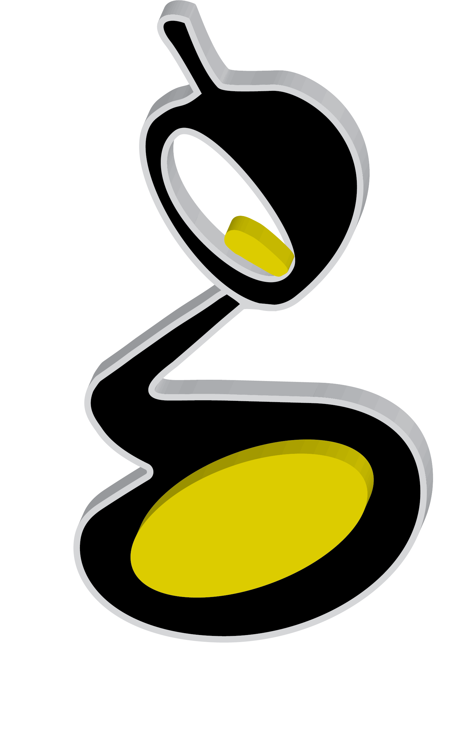
Graphic design logo created for our Personal Promotion brief. I used the lowercase 'g' from the 'Big Caslon' font family, tweaking it slightly to show a vial of ink being poured out.
This represents my illustrative style and my creativity using artistic styles in reaching design outcomes.
Brand guidelines and UX & logo design for my online app, On-u. Styles and layout were adjusted after involving the UX design process which indicated several issues with the usability of the brand.
The new design shows the letters of the brand (On-u) representing a shopper with bag underarm and displays a minimalistic but practical approach to brand concept and logo design.
I created an online shopping app with branding and UI design whose end goal was to bring shoppers together in a social and fun way.
The shoppers could download this app (On-u) to their mobile or desktops and join a shopping group set up by friends.
The group could select their favourite store from the app and once connected, browse and shop with the comfort of knowing that their friends were with them, offering opinions and suggestions on the items chosen. The app also allowed users to upload their profile and use the 'Try it on' feature to gauge how it looked before buying.
Posters designed for the 'Unlock' initiative brief. For this series of posters I focused on using typography as a strong visual identity with these designs making a very semiotic connection between the client and the project brief.
Brand design and logo concept for baby store 'Bambinos'.
I wanted to convey a softness and gentleness for the brand and used a baby
seated in a high chair with a halo beneath it.
